Custom Color Palettes
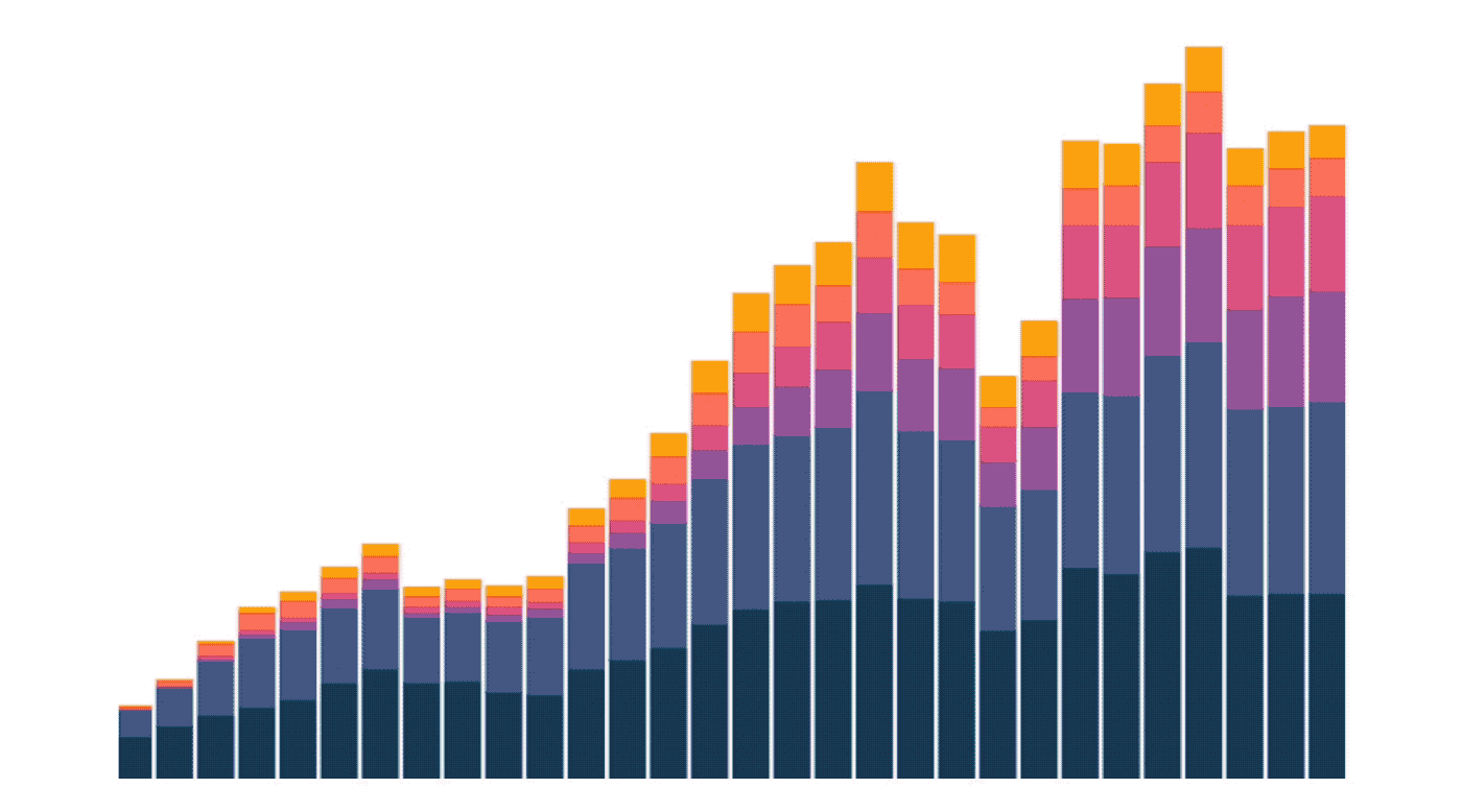
You can now add customized color palettes to your project and use them in any chart. Head over to the settings page to add new palettes or use DataOps to configure palettes with code. Use a custom color palette for a specific exploration to tell a more effective data story - like using green for increases and red for decreases in revenue.
You can also override Hashboard’s default color palette to make your project feel tailored to your organization. Your default palette will automatically be applied to every chart in your project that doesn’t have different custom colors configured.